

Printable invitations don’t have to look flat, generic, or obviously DIY. With the right design choices, they can feel thoughtful, polished, and completely custom—often at a fraction of the cost of professionally printed invites. Whether you’re planning a birthday, shower, holiday gathering, or casual celebration, a few smart tweaks can elevate your printables instantly.
The secret isn’t expensive software or advanced design skills. It’s about focusing on details that feel intentional. Let’s walk through how to design printable invitations that look custom, step by step.
Start With a Clear Theme and Mood
Before opening any design tool, pause and decide how the invitation should feel. Custom-looking invitations always have a clear direction.
Ask yourself:
- Is this event playful or elegant?
- Casual or formal?
- Seasonal or neutral?
Once you define the mood, every choice becomes easier—from fonts to colors to layout.
Helpful ways to lock in a theme:
- Pull inspiration from the event itself (venue, season, decor).
- Choose 2–3 descriptive words like soft, modern, cozy, or bold.
- Save a few inspiration images to guide your design.
Sticking to one clear vibe prevents overdesigning, which is the fastest way invitations start to look generic.
Choose Fonts That Feel Intentional
Fonts do most of the heavy lifting in printable invitation design. Custom-looking invites almost always use simple font pairings, not dozens of styles.
A reliable formula:
- One main font for names or the headline
- One clean font for details like date, time, and location
Good font tips:
- Avoid novelty fonts for body text.
- Use script fonts sparingly and only for emphasis.
- Keep spacing generous so text can breathe.
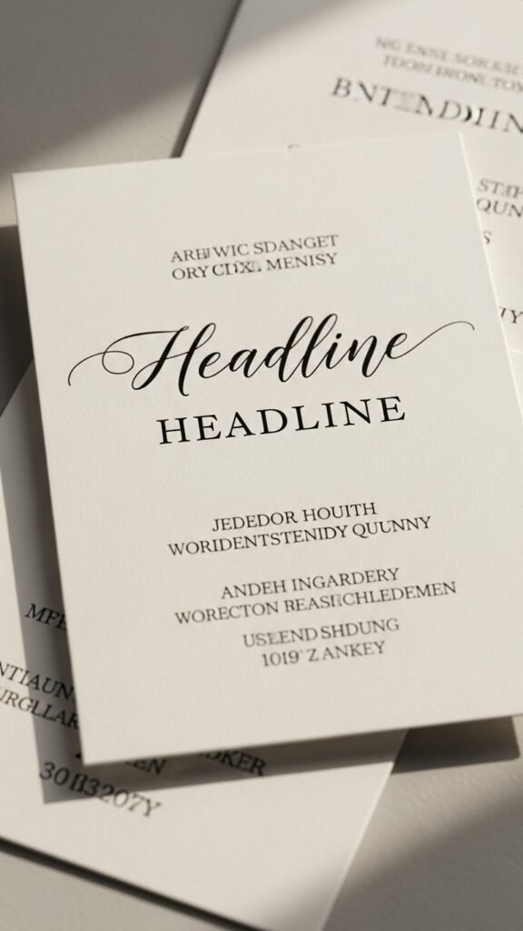
Spacing matters just as much as font choice. Increase line spacing slightly and give margins room. Crowded text is the fastest giveaway of a template look.
Build a Balanced Layout (Less Is More)
Custom invitations don’t feel busy. They feel calm, organized, and easy to read.
When arranging your layout:
- Center alignment feels classic and works well for most events.
- Left alignment feels modern and clean.
- Stick to one focal point (usually the event name or guest of honor).
Design tips that make a big difference:
- Group related info together (date + time, address on its own line).
- Use visual breaks like spacing instead of extra graphics.
- Resist filling every empty space.
White space is not wasted space. It’s what makes a printable invitation feel premium.
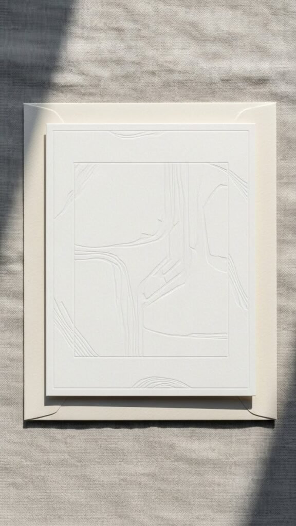
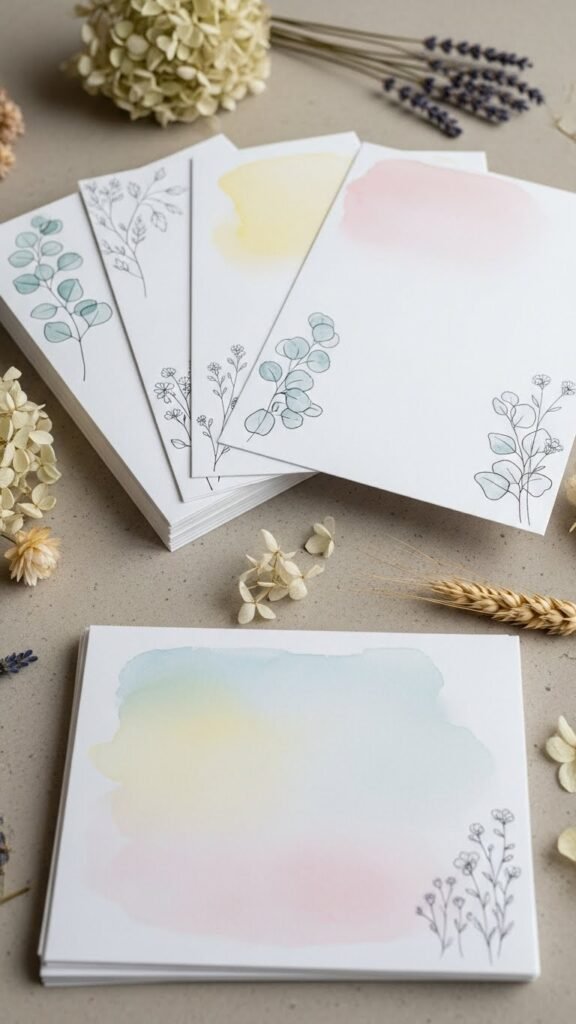
Add Subtle Design Details That Feel Custom
This is where printable invitations really shine. A few small touches can transform a simple design into something that feels tailor-made.
Ideas that work beautifully:
- Thin lines or borders
- Soft watercolor textures
- Light botanical or seasonal illustrations
- Simple icons (dots, stars, leaves)
The key word is subtle. One or two decorative elements are plenty.
Avoid:
- Overly bold clip art
- Heavy patterns behind text
- Too many colors fighting for attention
Think “hand-finished,” not “overdecorated.”
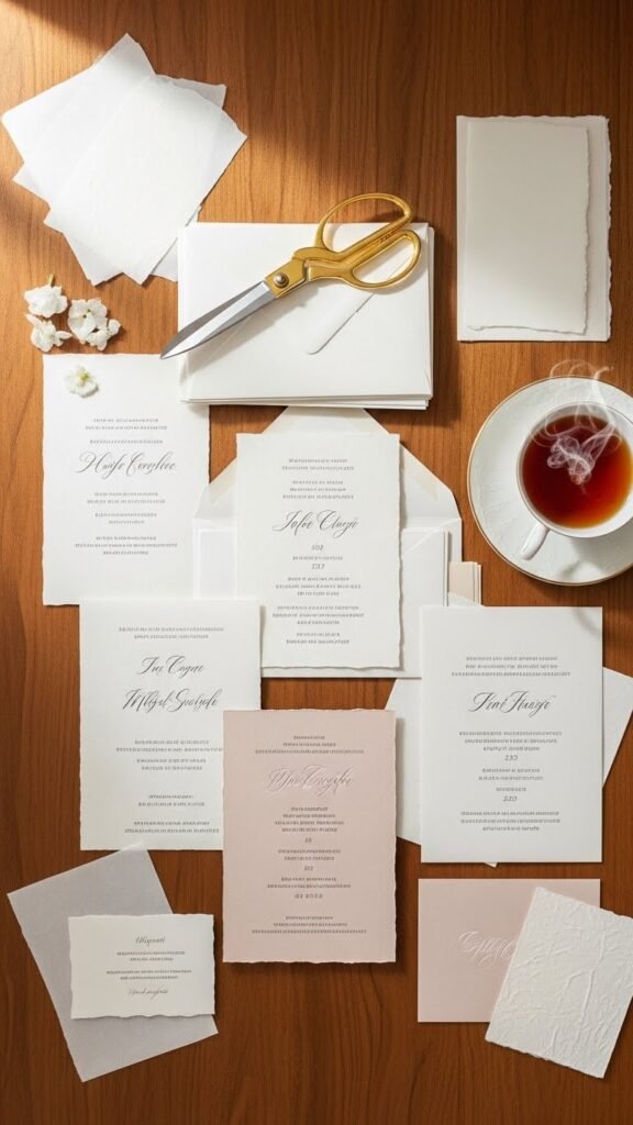
Pick Paper That Elevates the Design
Paper choice matters more than most people realize. The same design can look completely different depending on what it’s printed on.
Great options for custom-looking printables:
- Matte cardstock for a clean, modern feel
- Lightly textured paper for warmth
- Warm white instead of bright white for softness
Printing tips:
- Always print one test copy first.
- Use high-quality print settings.
- Let ink dry fully before stacking or trimming.
Even simple designs feel elevated when the paper feels good in hand.
Personalize With Small, Meaningful Touches
Customization doesn’t have to be complicated. Tiny personal details go a long way.
Easy personalization ideas:
- Use first names instead of generic titles.
- Add a short line like “Hosted at our home” or “Join us for a cozy evening.”
- Match envelope colors to the invitation palette.
- Handwrite guest names on envelopes.
These small choices make invitations feel thoughtful and intentional—exactly what people associate with custom design.
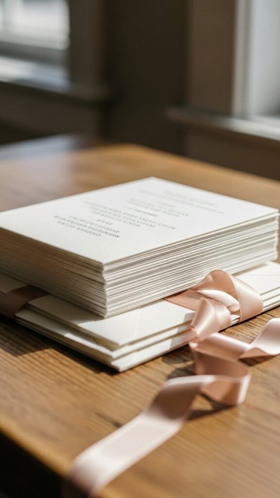
Proof, Print, and Finish With Care
Before printing the final batch:
- Double-check dates, times, and addresses.
- Print one final proof and review it in daylight.
- Trim edges slowly and evenly.
Optional finishing touches:
- Rounded corners
- Simple twine or ribbon
- Coordinating envelopes
None of these are required—but even one can elevate the final look.
Final Takeaway
Designing printable invitations that look custom is less about fancy tools and more about clear choices, clean design, and thoughtful details. When you focus on fonts, spacing, paper, and subtle personalization, your invitations won’t feel DIY—they’ll feel intentional and polished.
Save this guide for your next event, and enjoy creating invitations that look like they were made just for you.

Leave a Reply